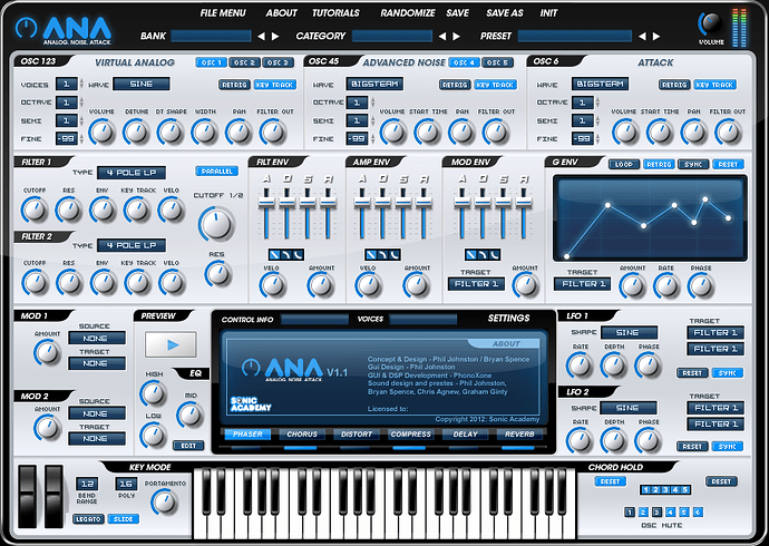
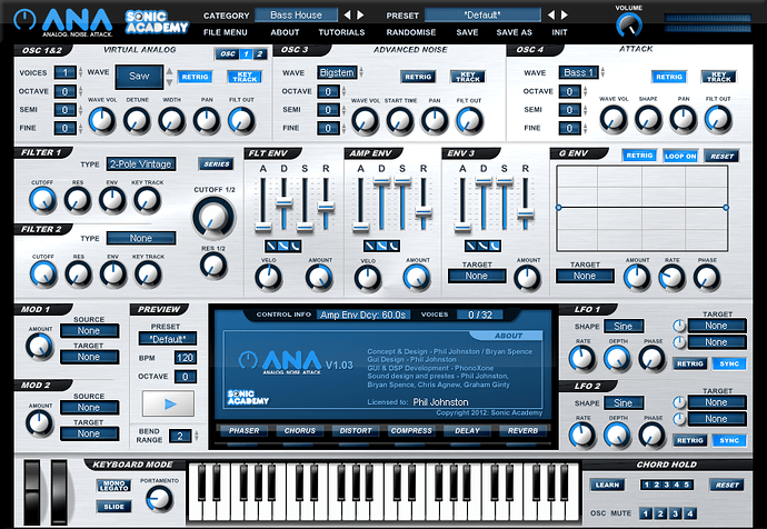
Ok so I took on board all the feedback (which was really helpful, thanks!) and reworked the design again.
Let me know what you think.
Cheers
Keyboard looks better, the Envelope selection looks better, I prefer the dark around the knobs in the old version.
I like it for all the reasons I mentioned before. Then again, it looks exactly like the one I pieced together so that helps a lot. :) Any further comment from me would be add no value.
Nice job!
I think maybe the grid lines on the G Env should be a little brighter so I don’t have to squint to see them. ![]() Otherwise it looks fantastic!
Otherwise it looks fantastic!
I like the old one better, mainly because it’s easier to read.
The new design looks super :w00t:![]()
I really like it except for the font in the selection boxes, i.e. the ones for the waveforms etc. I think that new font is alot harder to read, but I love the rest of the design
Yeah looking much better. I too, still prefer the black around the knobs rather than the grey. When comparing them to the Envelope faders, the faders just seem sharper. Otherwise looking great!
Side note, I just noticed we are going to have 2 new OSCs to play with! Weeeeeeee!
I like the font in the selection boxes from the old version more (better readable), and I would keep the same shades around the knobs. The rest of the new design is awesome.
dont like it.
old one is much better
looks to cyber and stars wars-ish
what was the matter with the original design anyway?
its quality!
i wouldnt changed it. at all. apart from tighter control on all ADSR’s
the numbers are weird and squigley on the new 1 and the round knobs hard to see coz the colours are just wrong
original all the way!
I prefer the way Sine etc is written on the old one. The font looks a bit ‘boxey’ now.
Yeah ive changed it back to the old one txt.
The stylized text on parameters is the only thing that I dislike. Everything else looks to be an improvement over all!

