With version 1.1 we are adding a few new features and i had to do a redesign… i got a bit carried away and reworked the whole thing.
I think its an improvement but im not sure everyone will.
Let me know what you like / dislike about it.
Cheers!
I quite like it.
Is there gonna be an indepth tutorial on how to use it soon? I’m still don’t really understand what the box in the top right corner does… I knwo that’s probably a noobish thing to say…!!
Much better-looking and more “ergonomic” (for lack of a better word). I especially like how the filter(s) and envelopes area(s) have been cleaned up (in my opinion). It’s a lot more organized-looking, as well. Can’t wait for the update.
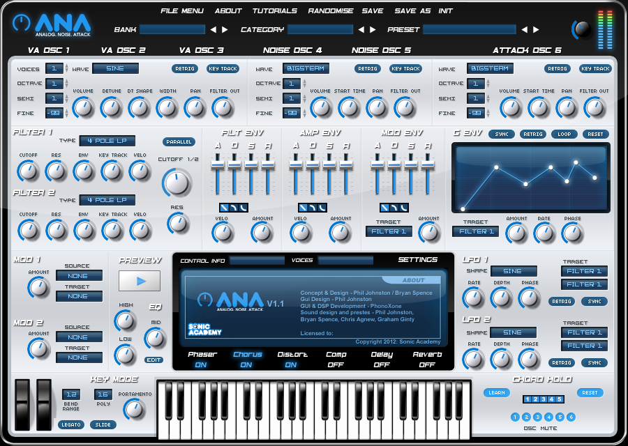
File menu: New (though it’s spelled “randomize”)
Bank/Category selection: Old - it looks really clean.
Category titles: Old - The light text on dark background makes them stand out better. As an aside, the category titles on top of the New one look out of place since they’re not in the dark gray border of the synth faceplate.
Volume button: Old - it’s easier to read.
Level meters: New. Red means bad and that’s good to see.
Context buttons: Old. Oval buttons are great but you can’t tell if it’s a button or a simple display. It could just be the bevel on the old style that make them look like buttons.
Envelope: New! That looks great!
Knobs: New! I like the look of the simple knobs with a nice dithered shadow.
Soft Display: Old. Buttons look like buttons and the lights under them tell you that it’s enabled.
Edges between sections: Old. Everything blends together on the top one and that makes looking for what you want to change a pain.
If I were to make it, this is what I’d like to see (forgive my MSPaint skilz, I’m at work w/o Ps):
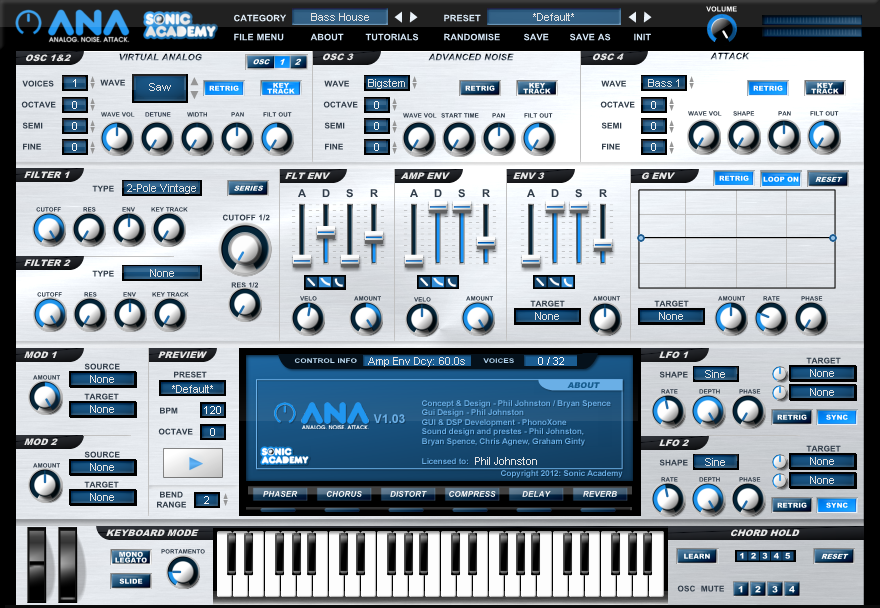
The bottom one (the old one) is much better looking imo.
[quote]rental01 (30/04/2012)[hr]File menu: New (though it’s spelled “randomize”)
Bank/Category selection: Old - it looks really clean.
Category titles: Old - The light text on dark background makes them stand out better. As an aside, the category titles on top of the New one look out of place since they’re not in the dark gray border of the synth faceplate.
Volume button: Old - it’s easier to read.
Level meters: New. Red means bad and that’s good to see.
Context buttons: Old. Oval buttons are great but you can’t tell if it’s a button or a simple display. It could just be the bevel on the old style that make them look like buttons.
Envelope: New! That looks great!
Knobs: New! I like the look of the simple knobs with a nice dithered shadow.
Soft Display: Old. Buttons look like buttons and the lights under them tell you that it’s enabled.
Edges between sections: Old. Everything blends together on the top one and that makes looking for what you want to change a pain.
If I were to make it, this is what I’d like to see (forgive my MSPaint skilz, I’m at work w/o Ps):[/quote]
Awesome thanks! Everything you say makes perfect sense. Exactly the type of feedback I was looking for. It’s so hard when you have been working on some thing so long to have perspective
[quote]phil johnston (30/04/2012)[hr]
Awesome thanks! Everything you say makes perfect sense. Exactly the type of feedback I was looking for. It’s so hard when you have been working on some thing so long to have perspective[/quote]
I do a lot of web work and logos on the side and it drives me nuts when people respond with terms like “that’s awesome” or “it looks okay” but really they’re thinking “if only the colors were a little brighter or there was a stronger shadow I’d really like it”. It gets worse the more people respect you - it’s like they’re afraid to tell you what they don’t like about what you’ve done. I, however, am not a respecter of persons. :D Glad to help out - I hope my answers (and the mashed together image) can help.
Truthfully mate, I much prefer the older one (if thats the bottom one, the one we already have). It just seem so much cleaner and easier to follow. I particularly like the black rings around the encoders rather than the grey/silver. Also, the fonts we’re great before hand, new looks kinda cheap and tacky.
EDIT: I do really like the new G-Env section though.