why such terrible fonts? and yet the plugin is loaded with a delay of 3 -4 seconds (((
Hey
Can you elaborate a bit please
were you experiencing a 3 - 4 second delay on opening the plugin on V1.05?
Can you provide your Computer Spec / Operating system details / DAW details
Windows 10 Pro 64-bit
Intel Core i5 4460 @ 3.20GHz
DDR3 12gb
Ableton 10 Studio one 4
and in ableton opens almost instantly, but studio one 4 delay when you open 2-3-4 seconds
What do you find terrible with the fonts ?
Thank you, and 1.05 didn’t have this problem in studio one 4 ?
it seemed to me that were previously more fluid and sharp now
I was in the early version, there is generally up to 7 seconds to open the plugin
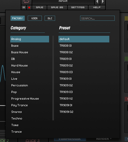
It’s an early 80s “future” style, and aside from looking ugly and outdated, it’s hard to read. Look at the “D&B” entry in Genres: it’s an almost unreadable mess of characters squidged together.
The font is unnecessarily wide, too, which means that names are getting truncated when they really don’t need to be. In DLC, I have two folders called “Nicky Romero…” and because they cut off, I don’t know which is which except by the contents. “Vol 4 Big Room” (not exactly a long name) becomes “Vol 4 Big Ro…”.
You could get a much classier look with one or two simple fonts. As it is, you’ve got far too many going on at once. There’s the blocky main font on most parameters, and then you’ve got another that only appears on the PITCH AMP CLICK buttons, a italic one that’s only there to say the word “LIMITER” on the meter, the menu font, and yet another font on the Save/Save As and Settings pages. Then you’ve got the logos fighting against all of that, too.
1 Like
sorry - can you clarify for me whether you still have the slow loading on Studio One 4 with KICK 2 v1.05 (Before this beta release)
before the beta was a long load, now much better, everything is OK
on beta version of all flies like normal