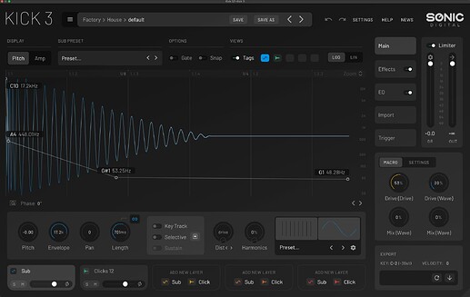
I have a decent LG ultrawide monitor, very good spec. Kick 2 looks nice, makes sense, easy to read, very clear, Kick 3 is non of those. I’ve just got round to installing the upgraded and oh my it looks bad. This isn’t just a preference thing or what I was used to because I hardly used kick 2, putting them side by side and the difference is insane. The 1st time kick 3 popped open on the screen it was “urrggh, what is that” I tried resizing then went straight to loading up my old kick 2, to double check, I don’t remember it looking bad like this! and sure enough, Kick 2 looks good, no tweaking setting. What is going on here? have I missed something?
Hi there,
Just to make sure we’re addressing this correctly :
-
Are you experiencing any actual display or scaling issues on your system (for example, blurriness, incorrect scaling, contrast problems, or UI elements not rendering properly on your ultra-wide monitor),
-
or is the issue primarily that you’re not getting along with the new visual design itself ?
→ We can understand that opening a new version and having that immediate “ugh” reaction is frustrating, especially when you’re comparing it side by side with something that already feels familiar and clear to you.
- That said and to give a bit of background:
→ KICK 3’s interface was redesigned using a flatter, more modern UI approach.
→ One of the practical benefits of this is performance — relying less on heavy bitmap graphics and images means faster loading times, lower GPU/CPU overhead, and more consistent behaviour across different systems and resolutions.
→ It also allows the interface to scale more cleanly and remain responsive as displays continue to evolve.
