Questions regarding skin creation (ANA v2.5.4+)

Ooops, I remembered you said it will be fixed, but apparently forgot you said “next release”, sorry.

Well, I’m not sure how much effort this takes, but I’m afraid this might even be something aiming more towards a version 3 of ANA.
All those inaccuracies need to be fixed at some point, sooner or later this will bite them anyway. But there’s much more besides that. Starting from being ranked in the Top 5 of most unorganized GUIs worldwide. Ever :stuck_out_tongue_winking_eye:
That GUI folder of the Black factory skin is, sorry, a mess. Contains files that probably belong to version 1 of ANA, or stuff like screenshots and Photoshop files (both attached). A large amount of files simply isn’t used and is literally trash for the recycle bin. I mean, doesn’t this unnecessarily eat up CPU resources (RAM)?
The “Black” factory skin folder carries 57 MB. I was using exactly that as starting point, currently I got 26 MB and haven’t even started cleaning it up :rofl:. I was just deleting stuff along the way when I was sure it wouldn’t be needed, still already a reduction of 50%.

IMO this GUI really needs to be overhauled.

Haven’t mentioned lots of little things, like knobs having different labels on <100% and >125% size. Look at the top left knob of the FX WShaper and CShaper. On 100% size it is labelled “LEVEL”, on 125% size it is labelled “SHAPE” (both factory skins, respective files attached).
And that’s not the only one.

BTW, is anyone using “Preset Skins”?
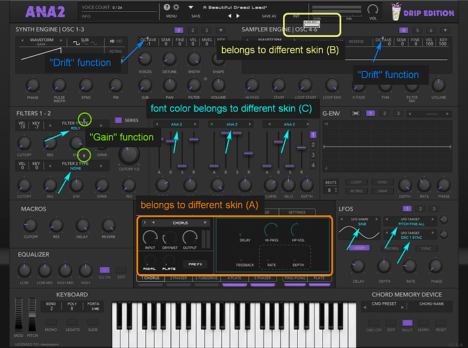
I’m not, but I can’t imagine one second this could be working properly. Here’s a screenshot I took at some point, I just thought this one’s too funny. It’s the “Drip” skin by EchoSoundWorks, but in fact it’s a conglomerate of at least 4 skins :rofl:

And this only happened when I wanted to compare something and switched between some skins, the regular way via “Settings”. So how on Earth could this work on a preset switching basis??

Ok enough ranting, in the end I just think this GUI needs to be seriously reworked.
Probably more suitable for a version 3.

attachments.zip (181.9 KB)
The “Preset Skins” feature was a request from Slate Digital and it actually works yes.
Have only noticed minor glitches like sometime the info box text color will keep the previous text color value after switching skin, although closing & reopening the GUI fixes this.

The “DRIP” skin ( and some other skins you can find on the forums or internet ) was done before ANA 2.5 and the introduction of the Multi-Samples sections for the GUI, so yes, might look a bit like a patchwork since all sections were not redesigned.

Overall, I think UI design is definitely something on it’s own and there’s obviously a gap between getting a functional skin or new flavor of styles & colors and crafting an accurate GUI.

With plugins being developed over time and adding new features and many of the UI elements being hard-coded, it’s definitely not easy to get something perfect for sure. That’s why many companies are outsourcing their UI design or have dedicated designers for this.

Personally I’m not too picky about plugins skins as long as the plugin itself sounds good or does a good job, that said I’m for sure also happy if I can get the best of both worlds within a plugin.

Just do your best, you’ve already seen how challenging this can be and you’ve already gone a long way, so I’m confident you’ll be able to get very decent results in the end :+1:

1 Like

I already thought before that’s sounding like a Slate idea lol.
Quite funny they are requesting something like that, and then they aren’t actually able to keep their skins up to date :partying_face:
I’m not 100% sure of it, but as far I know none of their skins has the “Drift” function implemented, for example

I’m quite surprised though that

I constantly have “hanging” elements from previous skins, when switching skins regularely via Settings. So I was quite sure this would all the more be the case when switching per preset.
Need to test that at some point, for some reason I never really did that. Maybe I was scared from what I expected I have to look at then :rofl: :wink:

1 Like

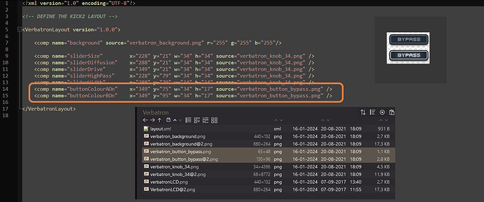
Does anyone accidently know why the Verbatron FX has a Bypass button?
Apparently related to “Colour A” and “Colour B”. Is that something that was planned, has this function been implemented at some point, has anyone ever seen this button on ANA2?

I assume it’s safe to delete it, if nobody tells me otherwise. Of course I don’t know if this might come back, my guess would be it has been an idea that was planned but abandoned later on.

Not sure where this is coming from TBH, don’t think that’s in use, so could probably be removed yes.

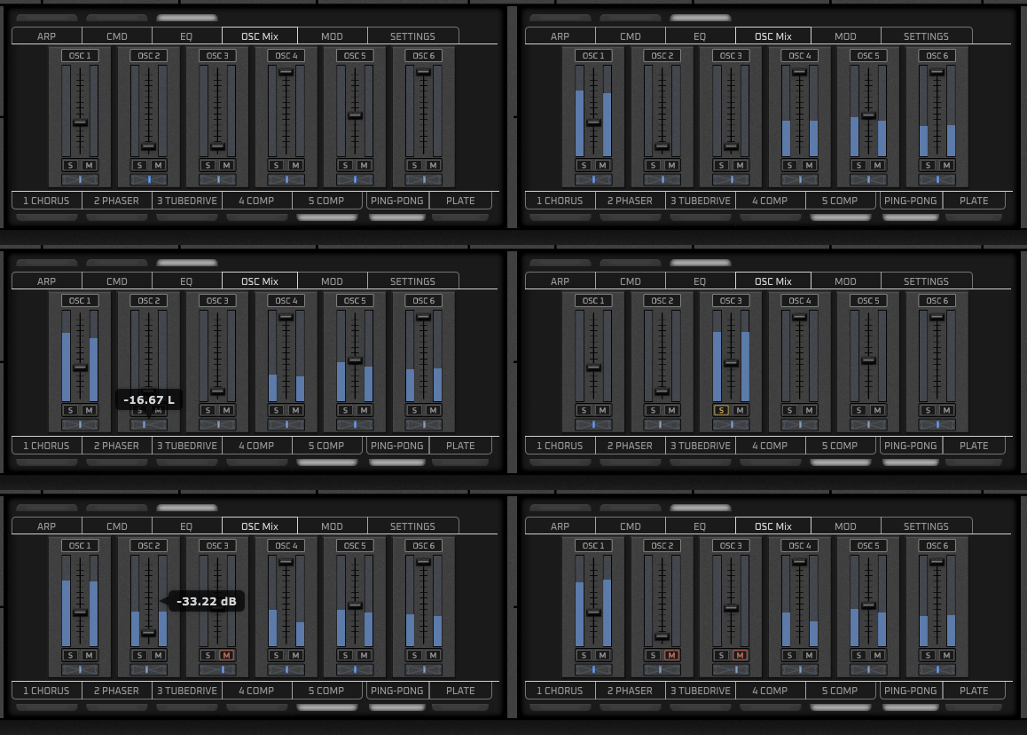
Had tough times with the OSC Mixer, pretty nasty section to work on.
Especially the panning slider is quite a strange customer :crazy_face:

Finally got something I might leave (more or less)

OMixer

Had almost no time for the skin over the last weeks, so not a lot of progress :slightly_frowning_face:
Somehow I’m sloooowly crawling closer though :snail:

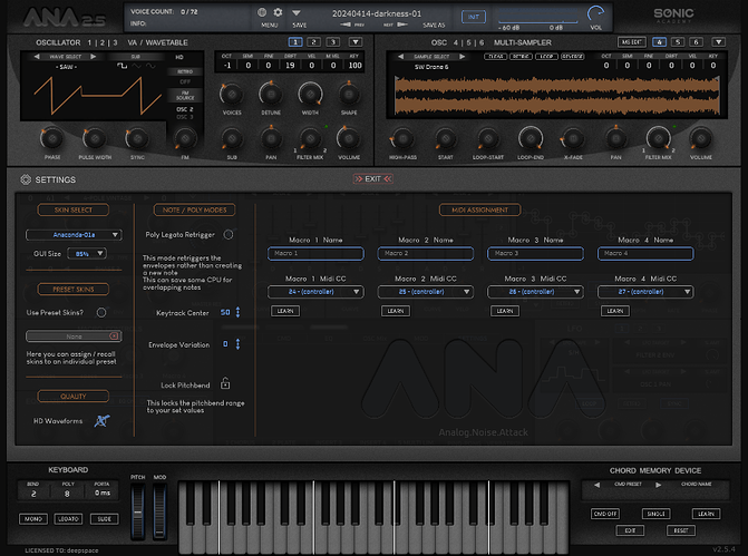
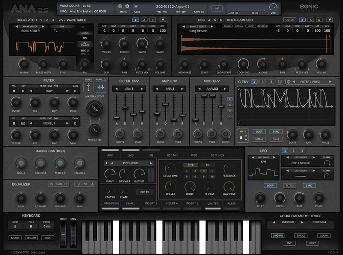
Quick tour of the current state:

1 Like

Amazing work so far IMO, looks great ! :+1:

Have you worked on the MSEDIT section yet for the Sampler OSC Multi-Sampling part ?

Nope, that’s one of the sections I have barely touched yet (next to Arp and CMD).
Is there a specific reason why you’re asking, something planned there?

By the way, if you’re interested I might provide you an early version so you could have a look at it. I’m staring at it for so long now and am already very used to how things look. A “fresh pair of eyes” might see things I’m not really recognizing anymore…
Only if you like to of course, and probably at some point towards the weekend or so. I’d need to fix some things before, but don’t really have time for this once again :neutral_face:

thx, btw

No, not that I’m aware of, that was just out of curiosity :wink:

Yep sure, that would be nice, you can PM me on the forums when you’ve got something ready and I will pass this to the developers as well :+1:

1 Like

Had only about two hours to spend on it the entire week :roll_eyes:
But the current state is fully functional so I could give that to you for testing. I uploaded it to a file hoster, along with a short to-do-list.
Should I send you the link via PM?

1 Like

The forums are on public reading access.

So depends if you’d like to share this with everyone or just us :wink:

So yes, PM me the link if you’d like to keep it private at the moment :+1:

yea I don’t want it floating around in that unfinished state it is in, to be honest.
I’ll share it for free once it’s done, but I think it’s too early to put in public at this point. I’ll PM you.

1 Like

Tekalight brought my attention to a rather ugly issue with the keyboard on certain sizes.

With GUI sizes from 150% upwards nasty vertical lines show up. I can’t check those large sizes on my own, because with a 1920x1080 screen I can’t see the keyboard from 150% GUI size anymore.
BUT to my surprise it also occurs in similar fashion with sizes smaller than 100%. It’s a bit of a mystery to me that I didn’t notice this earlier, because I’m checking those sizes on a regular basis. But for some reason I’ve never seen it (sometimes I got the strong feeling ANA is playing games with me anyway :laughing: )

GUI size 85%:

What’s happening here is:
there’s a sort of hardcoded, blank white surface lying underneath the graphics for the keyboard keys. I noticed this for the first time when creating my keyboard version. My original had a slight portion of transparency on it (where the white keys are rounded at the bottom), and when using it for the first time it was surprising that something dead white suddenly appeared. I solved it by adding a dark layer to cover it up.

To visualize it, here I made the .png image for the note A completely transparent:
(GUI size 100%)

So the reason for those white vertical lines with sizes of i.e. 175% or 80% is that ANA isn’t placing the files correctly, and that leads to that white surface underneath the graphics coming through.
And with an overall darker keyboard it ends up looking quite ugly with those sizes.

I’m not very confident if there’s a way to fix it, did some quick tests trying to turn the white into a black/dark grey (which would make the issue less obvious), but no success so far. If this is fully hardcoded chances to do something about it are bad.
For the moment I’m postponing this, it’s a time consuming thing because it requires back and forth testing possible solutions. Maybe I’ll try creating an alternate keyboard that’s set up differently, with focus on making those issues less obvious.

But I started working on the Arp/CMD and want to finish those first, then get back to the keyboard later on.

Not that I’m really expecting an answer, but is the position of the Close “Buttons” on Arp/CMD hardcoded?
Wanted to move that to the middle like I did on all popups (when there’s enough room) and so far it was always working. Everything’s looking similar in the .xml script as with the others, but changing the X and Y coordinates doesn’t seem to have an effect.

I asked the developers and the ARP/CMD Close Buttons position is hardcoded yes.

1 Like

Thanks for confirming :+1:
Knowing it for sure makes it easier to move on.

1 Like

:eyes:
Now that’s quite funny, I just stumbled upon Phil’s query post on the JUCE forum :wink:

December 2023. “skin generator”. Too bad it’s only saying “… one of our plugins …”, but chances aren’t too bad it’s referring to ANA… :thinking: :shushing_face: