Ok I’ll probably have some questions about the GUI along the way, hence opening a thread for that.
Kicking it off with this one I’m currently interested in:
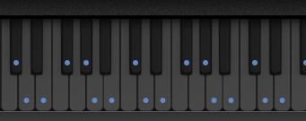
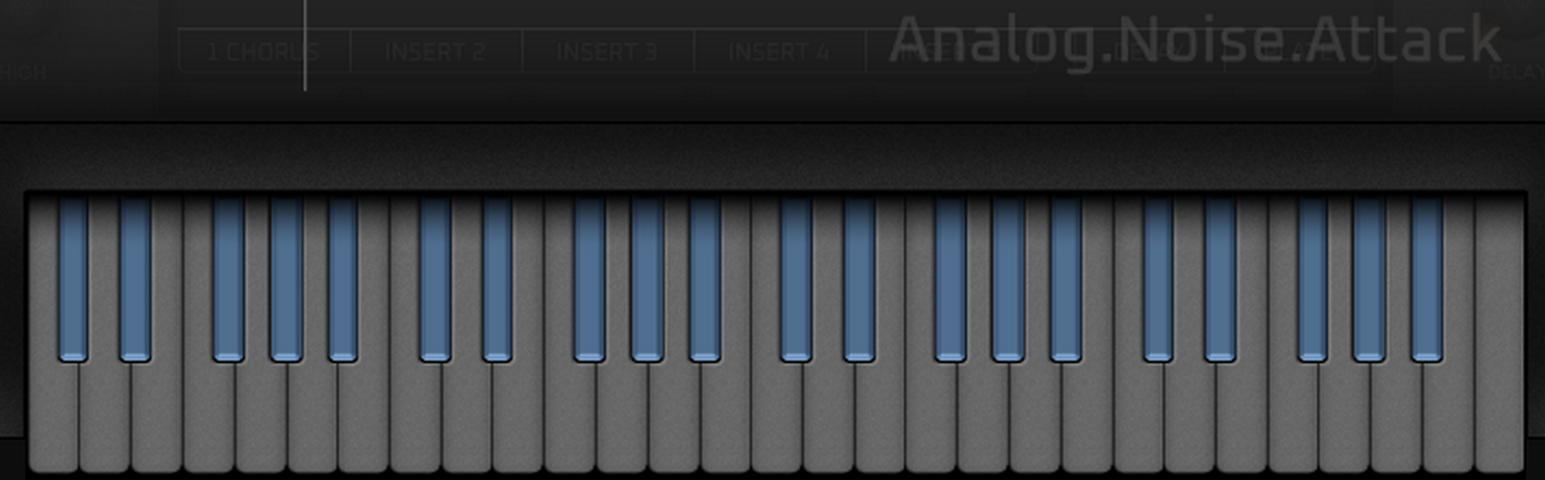
I’m trying to change the color of the indicator dots on the keyboard when CMD Multi is active.
They are exactly the same on every skin I’ve seen, so either nobody tried changing them or it’s not possible in the first place.
There are no (external) graphics files for them, maybe those are rendered/generated by the plugin. Still I think it might be possible to edit the color by adding that to the xml script.
But that would at least require to know exactly how this is named in the plugin code.
I’ve added a simple example line to the script, which I’m hoping could work out in the end.
Yea I’m afraid it simply isn’t set up to be customizable. On the other hand there’s a chance it just wasn’t added to the script.
Doesn’t make much sense though to blindly test it with randomly named designations…
Thanks already.
Seems the GUI really isn’t very flexible
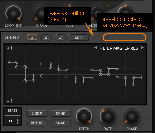
One thing I absolutely wanted to achieve was to provide a bit more functionality to the G-Env section on the main page. In particular being able to call up and also save G-Env presets. I always think it’s annoying having to open the editor page first only to load/switch a preset. Especially when you already created a bunch of presets you’re using on a regular basis. It simply would be way more handy to do this directly from the main page.
To me this is almost comparable as it would be required to open a different screen first, if you wanted to change the LFO shape from a Sine to a Triangle…
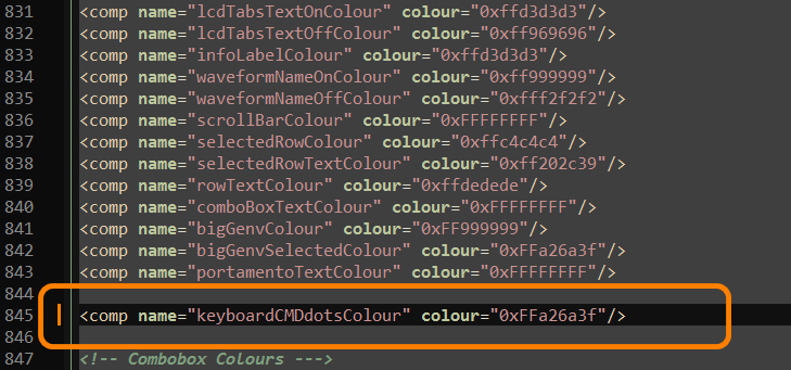
So I was moving things around a bit to create space for preset items (maybe a combobox or dropdown menu for loading, “save as” button) on the main G-Env section.
Since those items are already existing on the editor screen I thought it wouldn’t be too much of an issue to implement them on the main screen. But, well, it’s not working
Already tried a bunch of stuff in the script, like putting the two versions of “genvPresetsComboBox” in child/parent relation, but no success.
Totally seems ANA just can’t handle what she doesn’t explicit know.
In light of this I don’t think anymore it’s possible to change the color of the dots on the keyboard either
I’m fairly unhappy the preset stuff on the G-Env doesn’t seem to work, as I really think this would be a very nice little workflow improvement.
While on it I’ll take the chance and make this a feature request. Generally I assume it wouldn’t require all too much effort to implement this.
Guess I was just a bit frustrated yesterday that stuff like the G-Env preset thing isn’t possible with the ANA GUI.
After all it’s not that bad how it is. I’ll try working something out with the given possibilities, to give this a bit of a different feel.
It was disappointing that things like that aren’t working, as I also had in mind i.e. to throw an Arp Hold button onto the main interface (I often wish that could be turned on/off directly). But now I’m quite sure this won’t work either.
At least I’m starting to grasp what’s possible or not
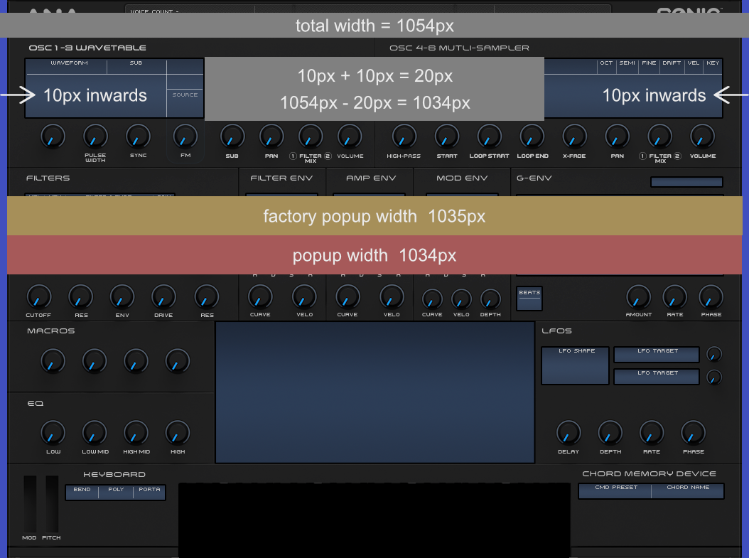
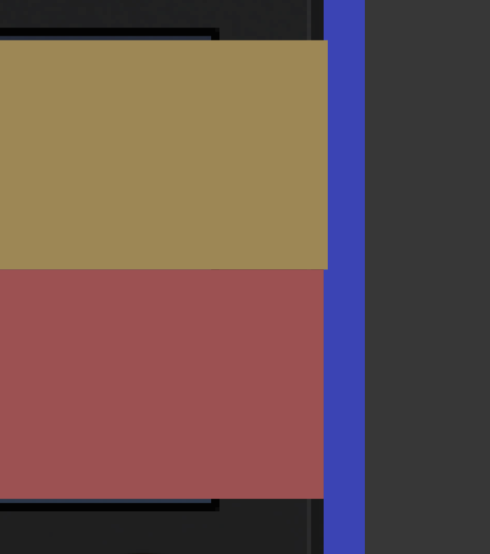
Apparently the sizing of the big popup windows (G-Env Editor, Settings, Mod Matrix, MS Edit) isn’t correct on the factory skins (xml and actual image size).
“x” for them is set to 10, so 10 in from the left of the GUI. To step in 10 from the right as well and having the popups centered, the width should be 1034 px, not 1035 px like they are.
Doesn’t sound a lot but when using clean edges it becomes obvious this is off.
The yellow line on the right represents how it’s set up on the factory skins.
Hmm, not sure about this and if it’s on purpose or not, but from what I can see the related PNG files are 2070x834 in size ( checking on a Mac here ) and 1035x2 is 2070 ??
And then there’s this thin Grey Border that might need to be taken in account as well maybe ?
But again, not sure about this and definitely not a skin expert here
Well, the point is that those 1035px (using always the @1 sizes because those are the relevant values for the xml) don’t exactly fit the center of the GUI.
The way the factory skins are designed it doesn’t play too much of a role, but when using straight edges it becomes apparent something’s not right. Here’s how it would look if I’d use the factory 1035px:
Clearly off.
It’s not that big of an issue, I’ll just change the width to 1034px. Those are simply the little details one has almost always to deal with when creating a skin. Just thought I’ll report it, might be nobody’s even aware of it.
EchoSoundWorks apparently noticed this, too. On his Drip Edition skin he worked around it by setting “x” to 0 and using the entire width of 1054px for the images. At least he did so for the big G-Env editor, on other popups he solved it differently.
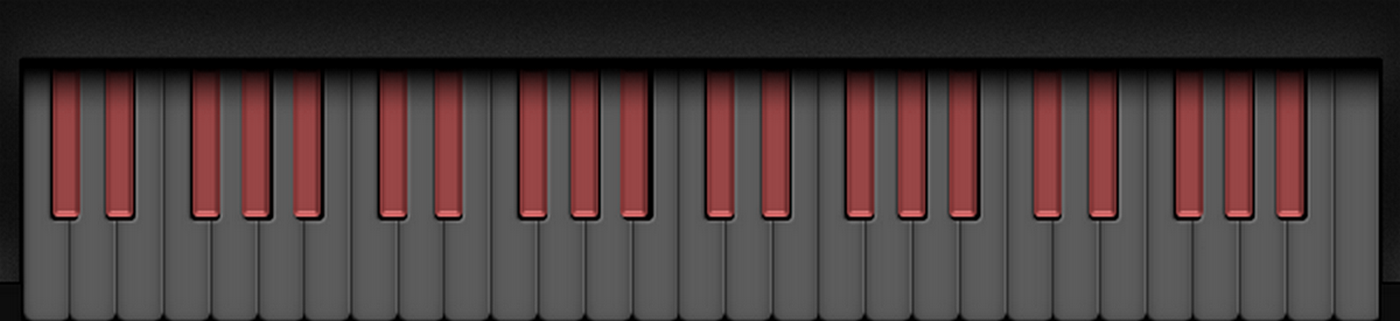
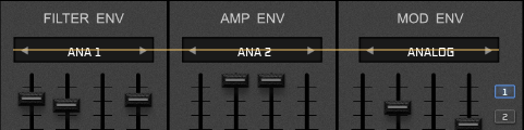
For reference, here’s the octave of white keys I created:
The black areas are NOT the actual black keys. That’s only a dark area lying underneath, to simulate a bit how it looks on a real keyboard. The actual black keys sit on top of that, as shown on the first screenshot.
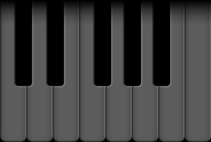
But as you can see, the placement is…
It’s even different from octave to octave and no real pattern to it.
And those positions aren’t determined in the xml script, so no chance for me to adjust that or to even comprehend what the exact placement of the black keys is.
It’s not even possible to calculate the inaccuracies in and adapt the graphics to the “errors”, because I only got one octave and the “errors” differ by octave lol.
So, probably I have to throw all that into the trahscan. Wasn’t really finished, colors, shadows and so on weren’t there yet. But the basics were done.
Stuff like that eats up so much more extra time… (and this one is already quite time intense anyway)
If i remember back the skin designs where originally made in the lower resolution version. in that version everything is probably more pixel accurate. the upscaling to HD version created some miss-alignment.
if you have an old 1080p screen you could use it to see the SD version.
Screenshot taken with 100% size. Still a bit off occasionaly, but that might be on my part (as mentioned, I can’t look up the exact positioning of the black keys anywhere, so it’s a bit of guessing)
But it’s already looking way better there.
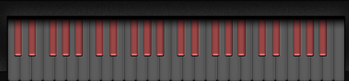
Here’s how it’s supposed to look (not the GUI, screenshot taken from the image software I’m using):
(still with that ugly color for the blacks lol)
Guess this isn’t the only area where the upscaling caused some things to be off.
Still thinking about how to handle the keyboard.
After what Phil said it’s safe to say there’s no way to prevent the black keys from behaving like they do (125% sizes upwards).
I just had an idea for a workaround that might be applicable. If I can integrate the final black keys (in “not pressed” state) into the graphics for the white keys, and then make the “not pressed” part of the actual black keys graphics fully transparent, the positioning won’t matter anymore because it’s simply not visible. Still it would seem they are there since they are implemented into the white keys.
Of course I’d need to keep the “pressed” state of the black keys graphics visible, but with those there’s more room to maneuver and it should be easier to conceal the inaccuracies.
Need to test if it’s working and how it possibly looks.
If it doesn’t turn out good, I’ll probably do this:
a) finishing this keyboard pretty much like intended, as it’s looking ok at least up to 100% sizes. Likely with some adjustments to the graphics to (hopefully) make the inaccuracies less obvious with 125%+ sizes.
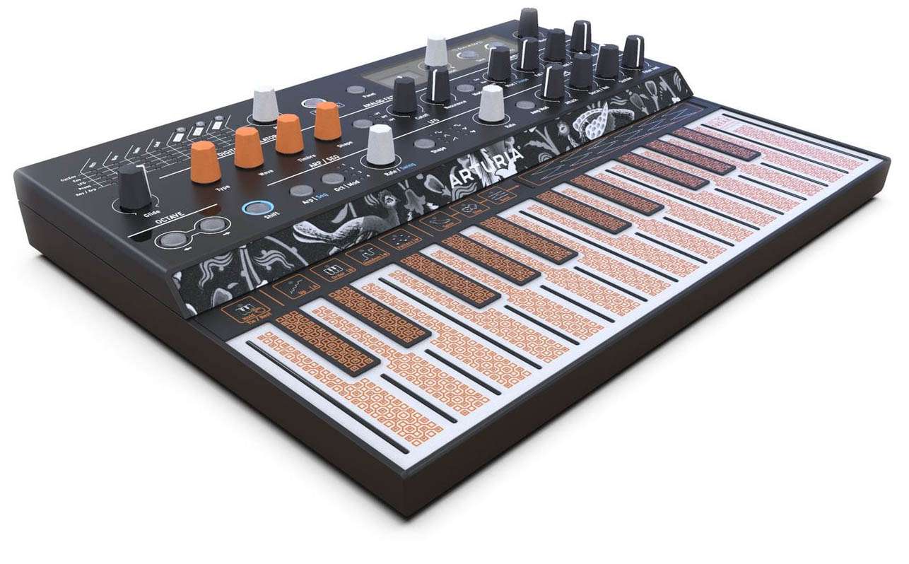
b) creating an alternate keyboard that is less conventional, maybe something like those other folks did on the SD-1 skin. In the realm of Current or Arturia’s little hardware gem MicroFreak
In general I think a conventional keyboard is more suitable for ANA, but with an “out of the ordinary” keyboard it should be easier to handle the issue.
And likely I’ll provide that as an alternate option, depending on what it will look like in the end.
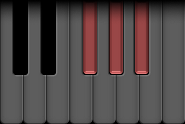
Screenshot taken with GUI size 125%.
Quite some difference compared to how it looked before. Still need to figure out how to make it look good when a black key is pressed. The “dummy” black keys likely won’t work as they are here. But that’s not so important for the moment. The main thing was to find out if that workaround method works in principle.
Seems it does, and this might even provide additional options.
For info purpose, is there any chance the miss-alignments could be fixed in a foreseeable update?
I believe this must also be the reason for fonts quite often going out of place, between <100% and >125% sizes.
Example envelope types, first shot is taken with GUI size 100%
The text is quite well aligned to the center of the boxes.
Next shot taken with size 125%
This time the text is placed a good portion lower than before.
Of course if I would make it fit to the center on >125% size is goes off on <100% size. It’s frustrating when you’re trying to align things accurately, and then ANA throws them where she wants lol.
So I’d be curious if this might see a fix from developer’s side in the (near) future, or if I have to find a workaround, balance it out somehow, or whatever.
And while on it, will the FilterMix knob on the Sampler OSCs be fixed in the next update?